颜色对比度 | Android 无障碍功能开发小技巧

颜色对比度 | Android 无障碍功能开发小技巧

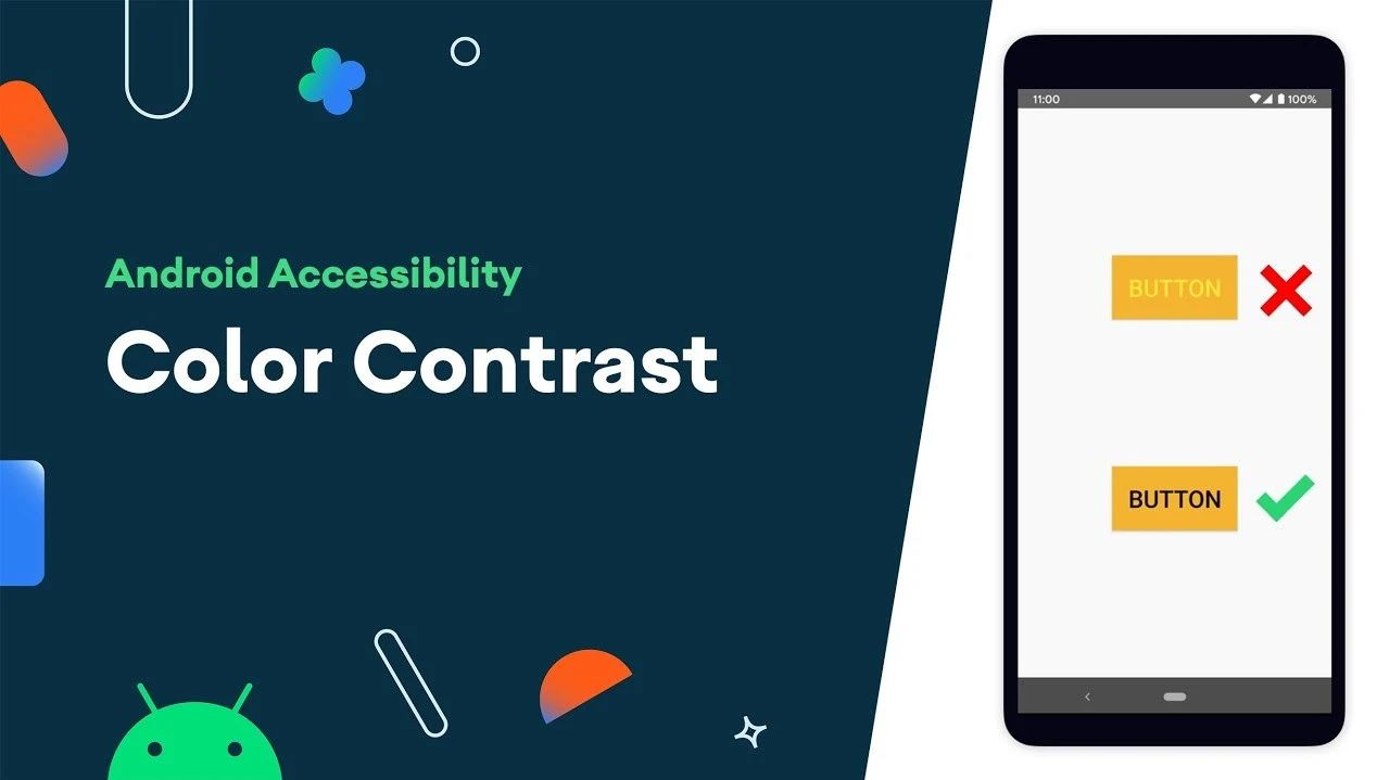
为应用内的各种元素采用适当的颜色对比度,对于为所有用户提供出色体验至关重要。适当的颜色对比度可以帮助有视力障碍的用户更轻松地使用您的应用。

即刻了解 Android 无障碍功能 → https://developer.android.google.cn/studio/intro/accessibility
构建无障碍功能更出色的应用 → https://developer.android.google.cn/guide/topics/ui/accessibility

版权声明

禁止一切形式的转载-禁止商用-禁止衍生 申请授权

脉脉不得语
脉脉不得语
Zhengzhou Website
Android Developer | https://androiddevtools.cn and https://androidweekly.io WebMaster | GDG Zhengzhou Funder & Ex Organizer | http://Toast.show(∞) Podcast Host

你已经成功订阅到 Android 开发技术周报
太棒了!接下来,完成检验以获得全部访问权限 Android 开发技术周报
欢迎回来!你已经成功登录了。
Unable to sign you in. Please try again.
成功!您的帐户已完全激活,您现在可以访问所有内容。
Error! Stripe checkout failed.
Success! Your billing info is updated.
Error! Billing info update failed.